← Selected work

Tough Mother Biltong

Tough by name. No BS by nature.

Functional food for women, in a category that had only ever spoken to them about losing weight.

  • Brand identity
  • Packaging
  • Copywriting
  • Launch photography
  • Shopify design and build
  • Social media
  • Email campaigns

Client

Tough Mother Biltong

Sector

Consumer packaged goods

Scope

Strategy, brand, packaging, store, and the content after it

The brand book, end to end

The brief

Where it started.

The protein category grew up around one assumed customer: male, performance-focused, buying in bulk. Women were served as an afterthought, and on the rare occasion they were addressed directly the framing narrowed to two options, weight loss or anti-aging. Neither speaks to strength.

Kat is a lawyer and a postpartum mother. She found biltong, which is air-dried rather than cooked and had carried people through long days long before anybody called it protein, and it worked. She put it simply, and it became the brand’s starting point: “I needed something that actually worked. Biltong changed everything. So I kept it close. And I want every woman to know about it.”

The approach

What we did about it.

It’s a protein snack, in a category that’s crowded and male-coded. So the first decision was to make it look and sound like nothing else on that shelf, with a brand wide enough to hold whatever Kat makes next without a rebrand.

Everything after that follows from one rule: never weight loss, always fuel. Clean because the ingredients are legible, not because clean is a trend. A use occasion nobody had claimed, the snack that travels with you rather than the one you prep before you leave. And a pack that stops the hand on a shelf full of lookalikes.

01

Identity

Not a mascot. A symbol.

The mark is a lioness with wings: mother, power, protection. Around it sits a full system, from wordmark and two typefaces to a sixteen-colour palette and nineteen icons, documented in ninety-eight pages so the brand holds its shape on a pack, a post or an invoice, with or without us.

The icons work on two levels. Some name what’s inside and how it’s made: beef, salt, vinegar, air. Others name what the brand believes in: strength, energy, clarity, sisterhood, pride. One line weight, one palette, so the ingredients and the ideals speak at the same volume.

The winged lioness on a pink gradient

Icons library

  • Beef
  • Garlic
  • Chili
  • Smoke
  • No Heat
  • Apple Cider Vinegar
  • Beef / Grass-Fed
  • Energy
  • Pride
  • Salt
  • Resealable Bag
  • Sisterhood
  • Clarity
  • Protein / Strength II
  • Cured Slow
  • Protein / Strength
  • No Gluten
  • Zero Sugar
  • Air-Dried
02

Applied

The mark, off the page.

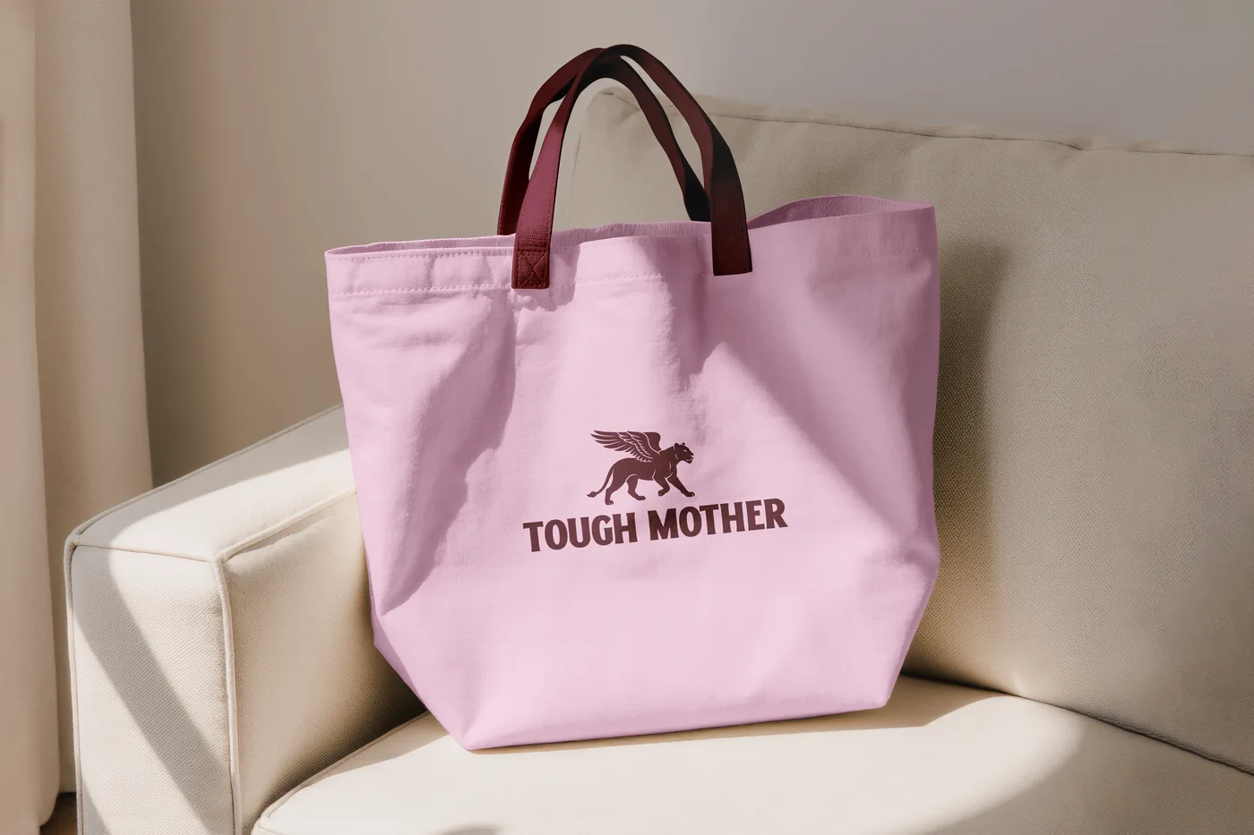
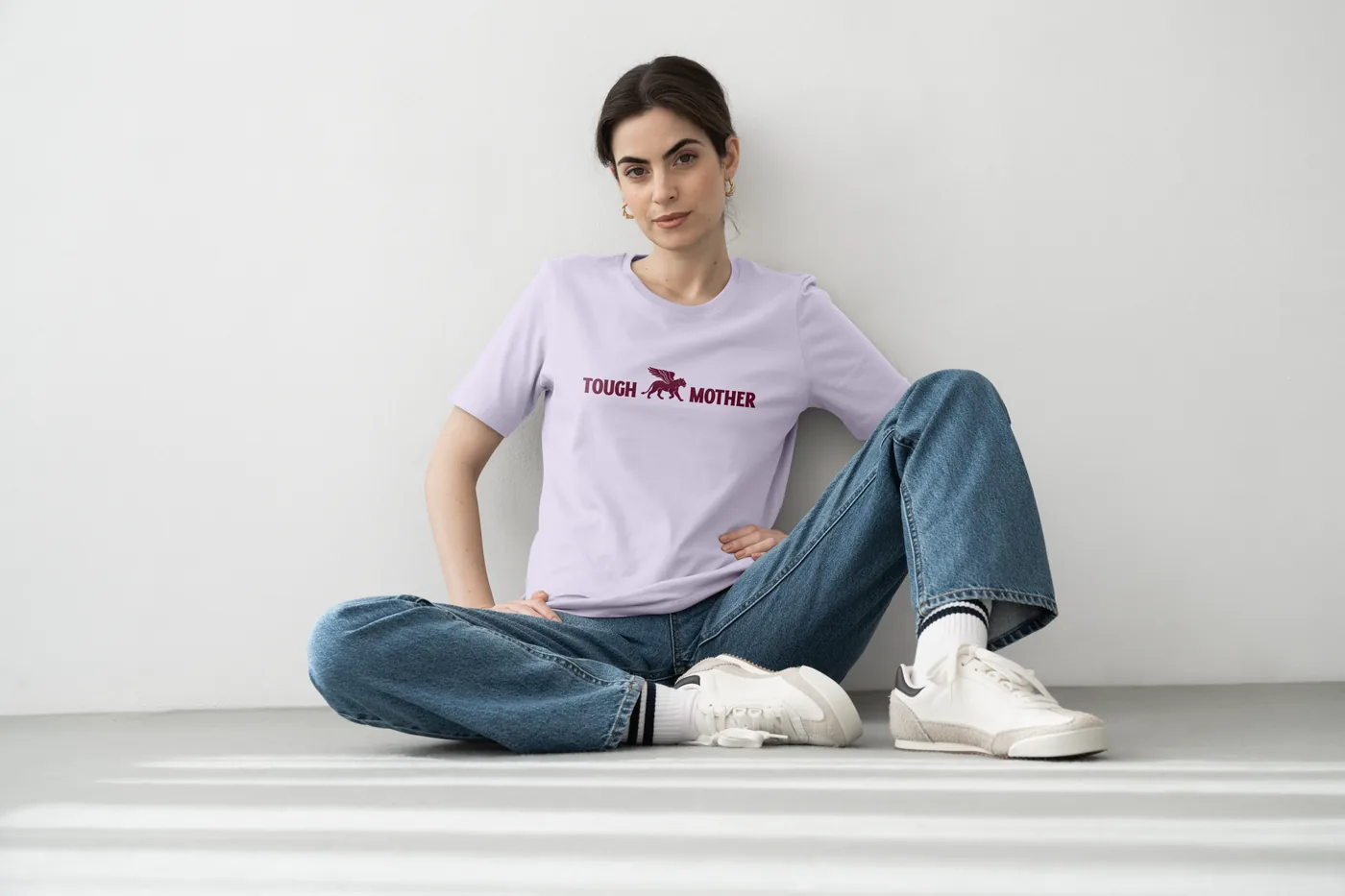
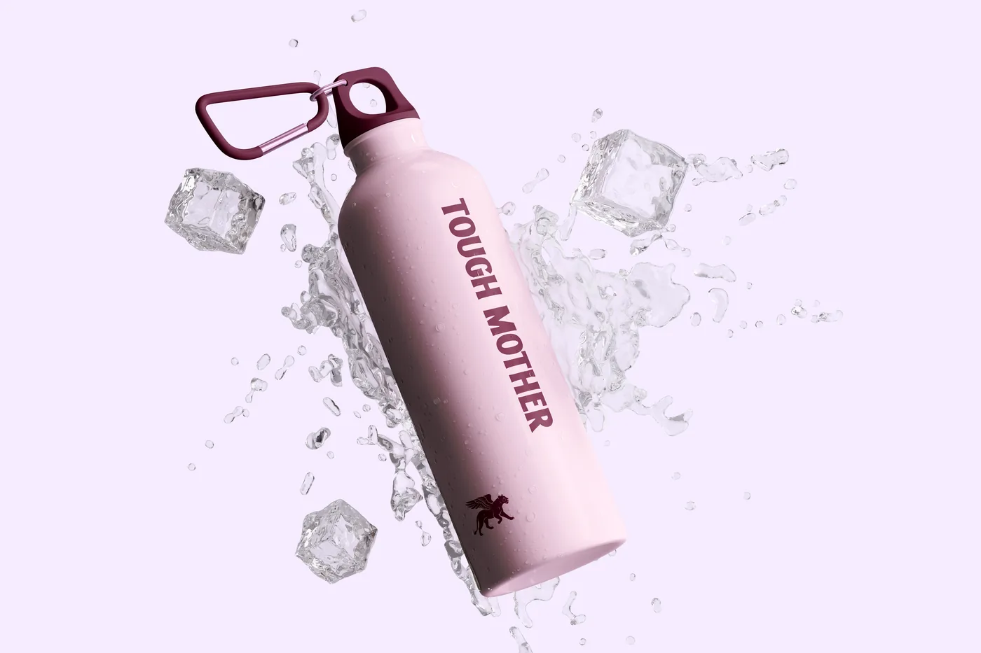
Every brand ends up needing merch. For one built on a snack that travels with you, it is less an afterthought than an extension — a tote, a bottle and a t-shirt go the same places the pack does, on the same day, with the same woman. The cards are the team’s founding staple: the one piece here made for the people building the brand rather than for the woman buying it.

A pink Tough Mother tote bag with the winged lioness, on a chair
A woman in a lilac Tough Mother t-shirt, sitting against a white wall
A pink Tough Mother water bottle among ice cubes
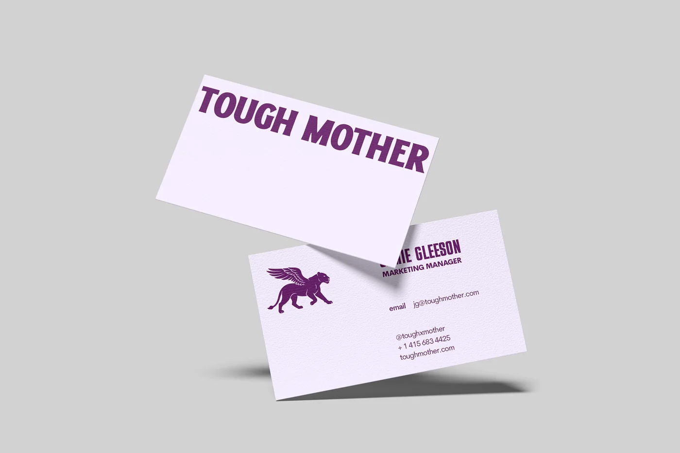
Two Tough Mother business cards, the wordmark on one and the winged lioness with contact details on the other
03

Packaging

The pack had to do the explaining.

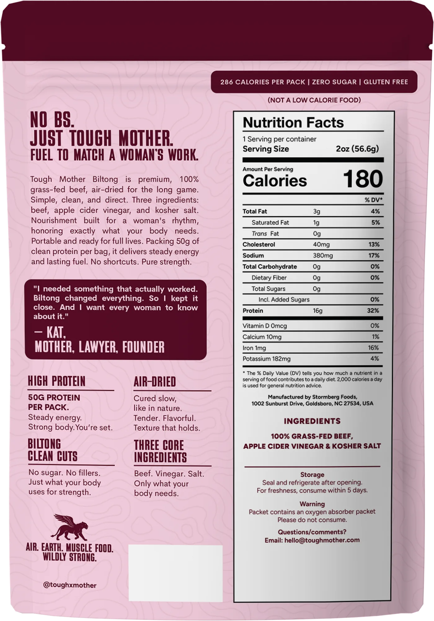
Every competing biltong ships in the same plastic tear-open bag, so the format was an opportunity rather than a container. The front has about two seconds to say what this is. The back has room to say why it matters, and uses all of it: the panel, the three ingredients, and the founder’s line about why any of this exists.

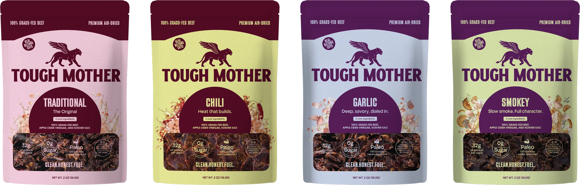
All four pouches side by side: Traditional, Chili, Garlic and Smokey
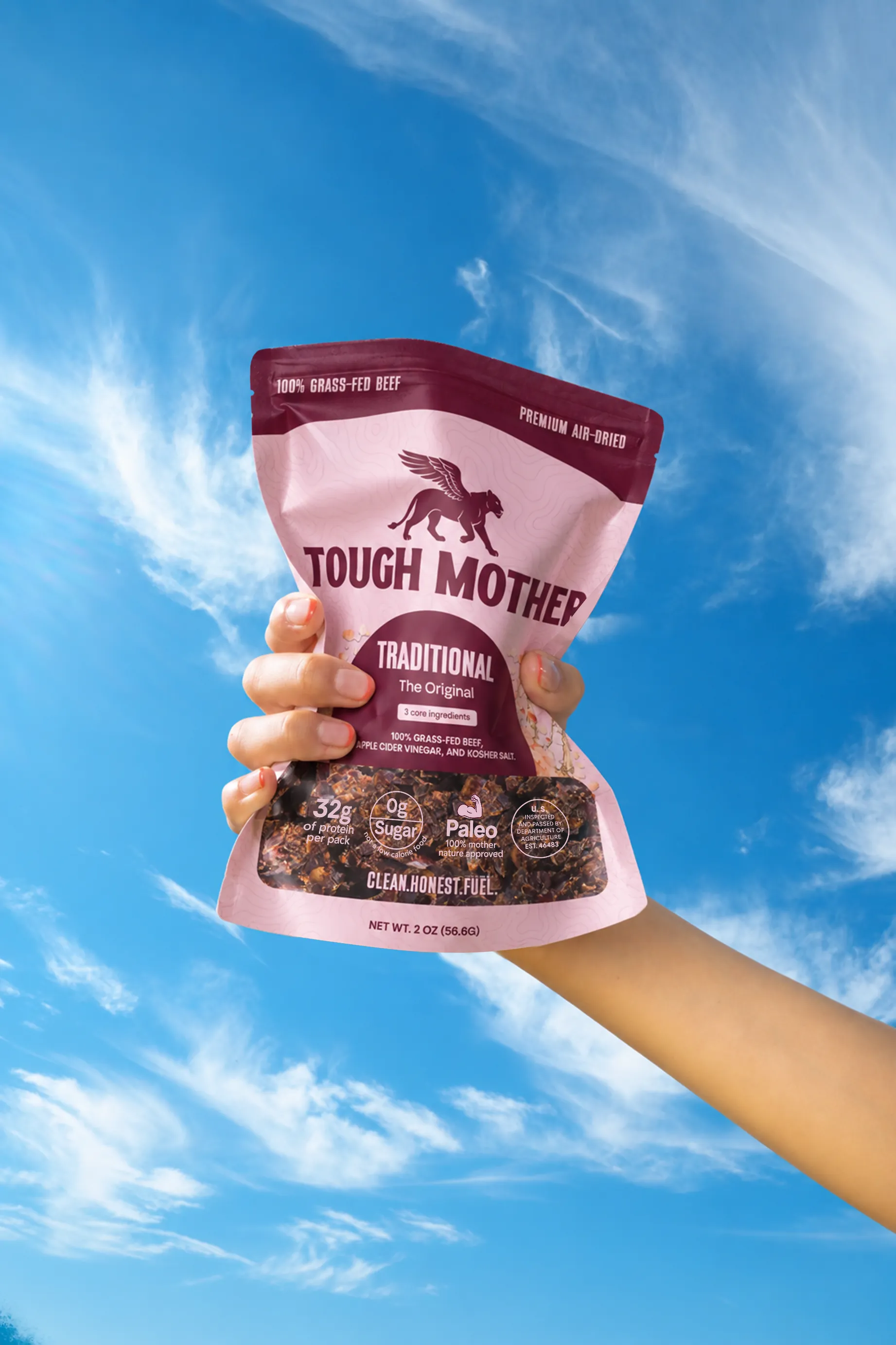
A hand holding up a pouch of Tough Mother biltong against a blue sky
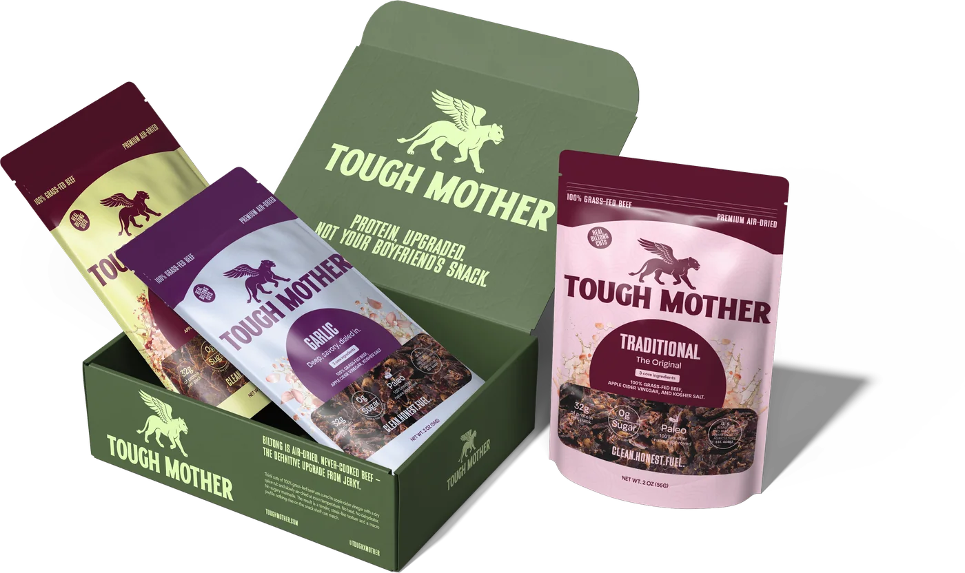
The variety three-pack: the carton open with two pouches in it and the Traditional pouch beside it
The back of the Traditional pouch: nutrition panel, three ingredients, and a line from the founder
Everything the front had no room for
04

The carry

The snack that
travels with you.

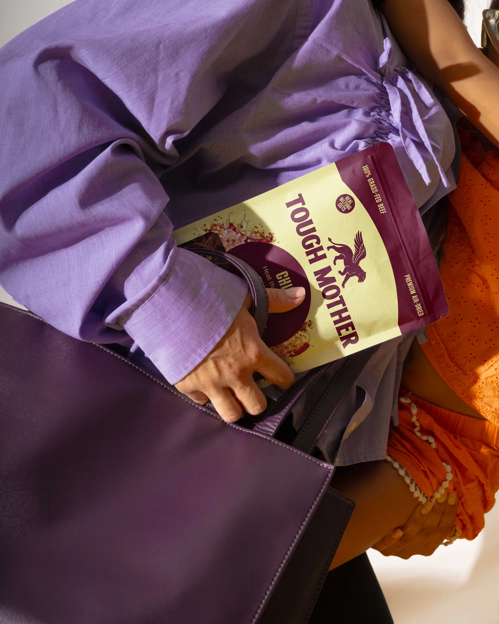
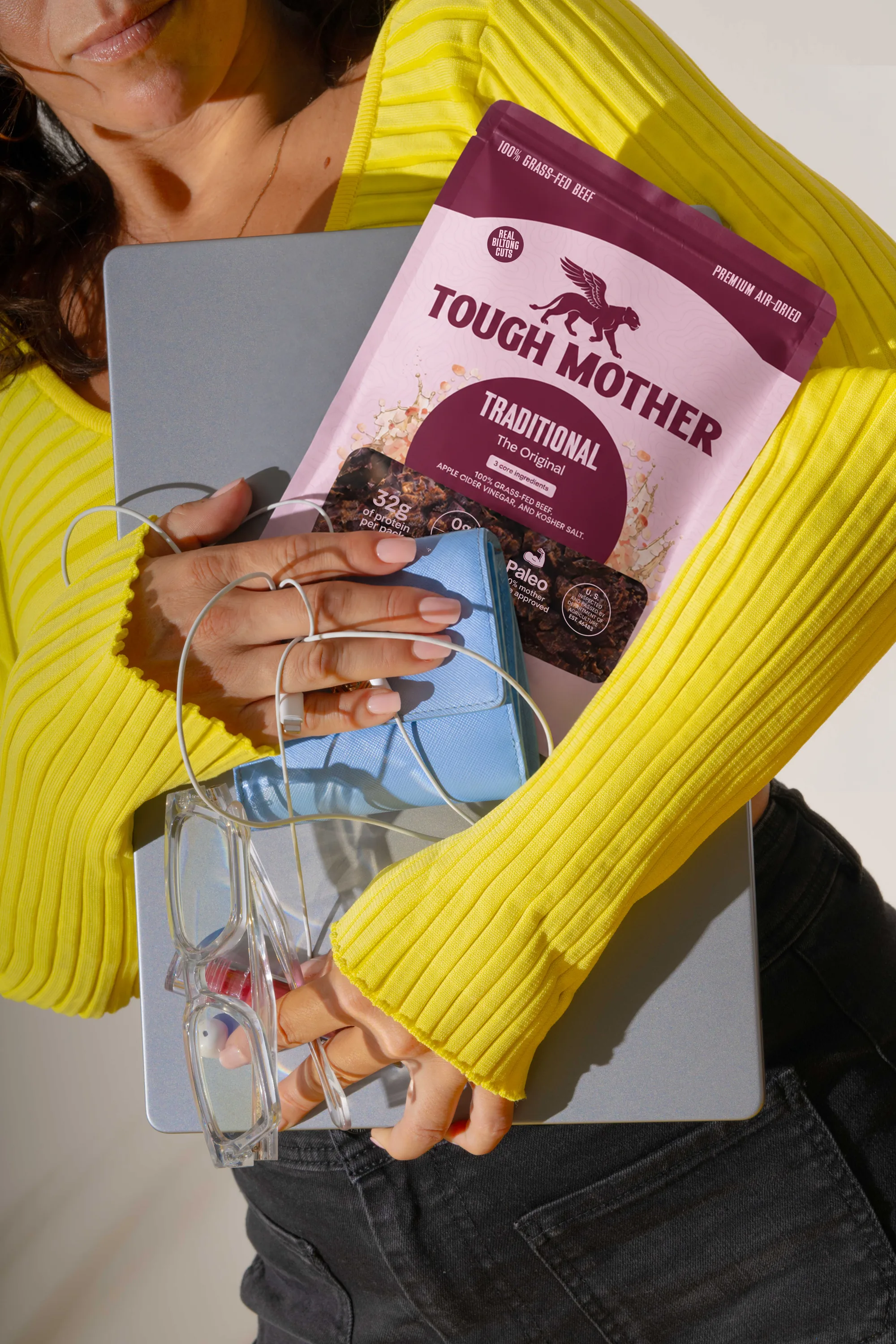
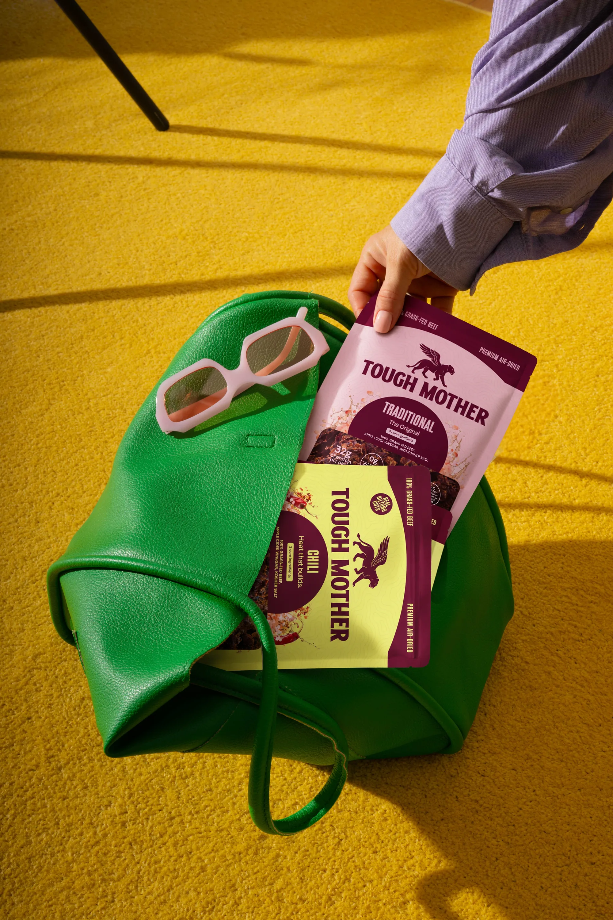
One of the five things built into this brand rather than added to it afterwards. Nobody else in the category had claimed the use occasion: in your bag, in the pickup line, in the glove compartment, between meetings. Not the one you prepare before you leave.

A pouch of Chili going into a tote, held by a woman carrying a child on her hip
A hand holding two pieces of biltong up against a blue sky
A woman in a yellow sweater holding a Traditional pouch against a laptop and a pair of glasses
Traditional and Chili pouches going into a green leather tote on a yellow carpet
Three hands held up against a blue sky, each holding a piece of biltong
Brand statement
05

The store

A store that
does the explaining.

Biltong is new to most people, and nobody picks up an unfamiliar bag in a shop until someone has told them what it is. So the online store comes first: it answers every question a first-time buyer has before she asks it, and builds the familiarity that makes the shelf work later. Designed and built on Shopify, and set up so the brand can run it on its own.

06

Social

Teaching a category,
one story at a time.

A month of Instagram stories, planned in four weeks that each do one job: discover, learn, entice, convert. Most of them answer a question the pack had no room for. What biltong is, how it is made, why it is not jerky.

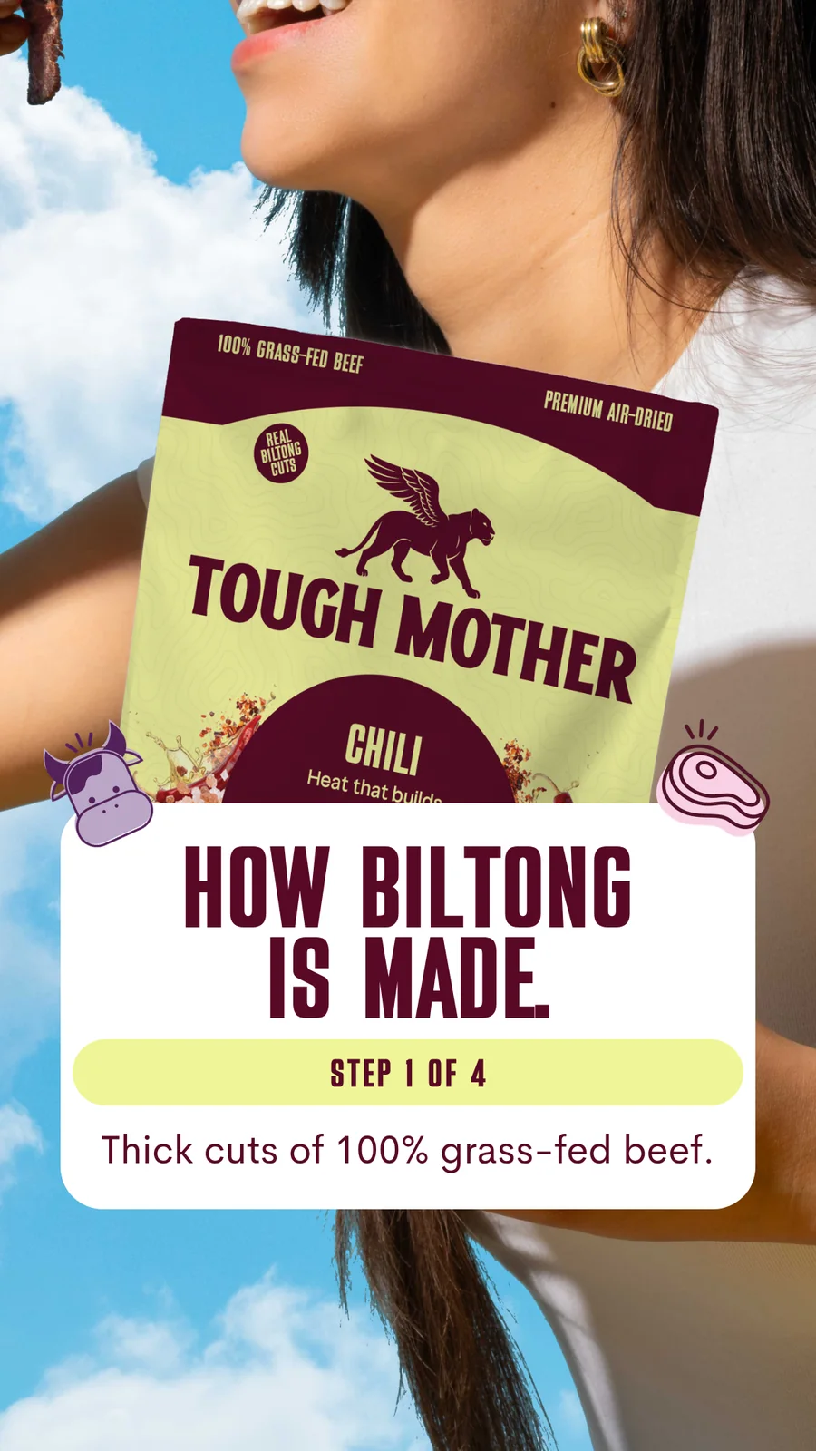
Story: how biltong is made, step one of four, over a woman holding the Chili pouch against the sky
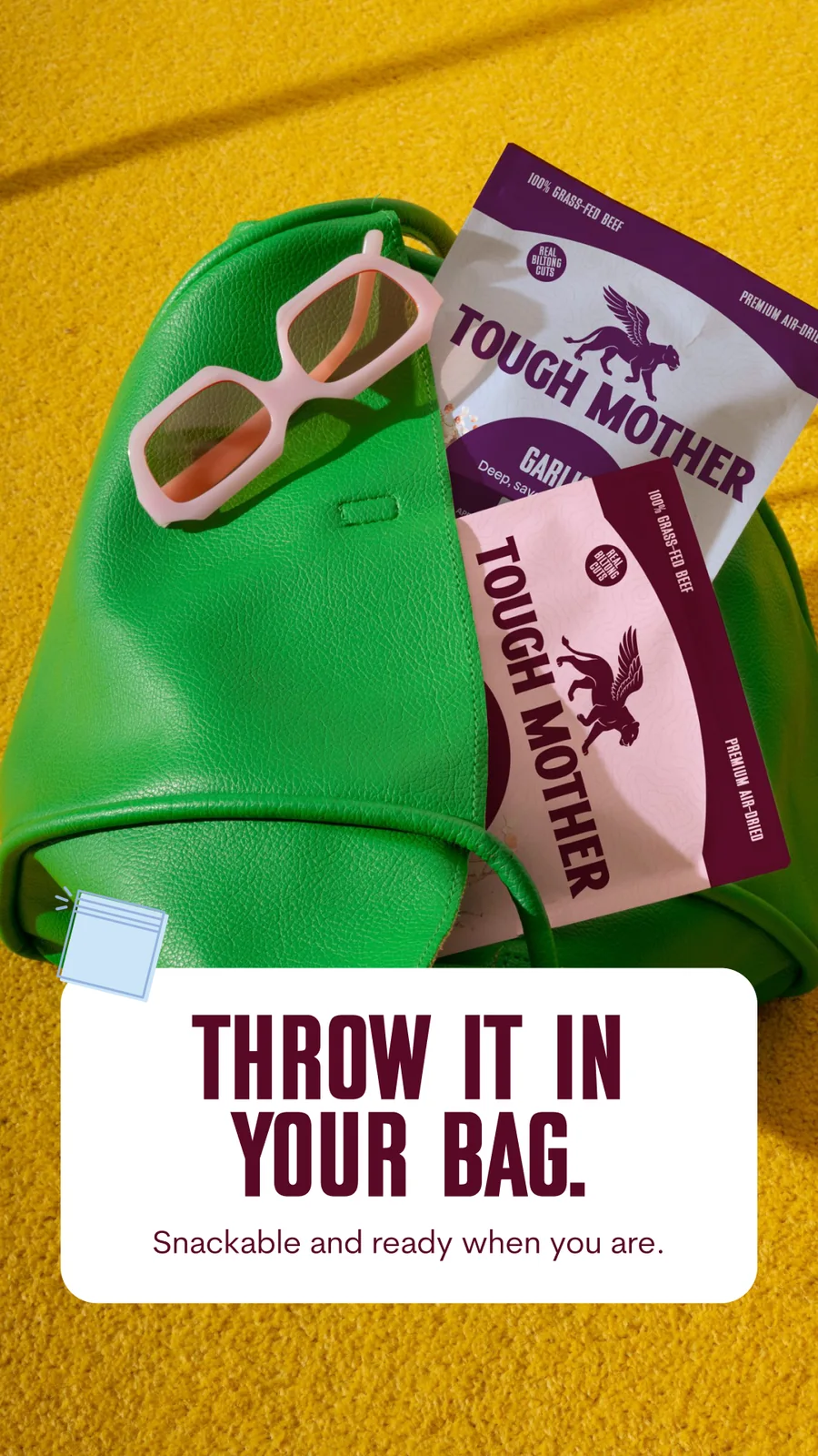
Story: throw it in your bag, with pouches and sunglasses in a green tote
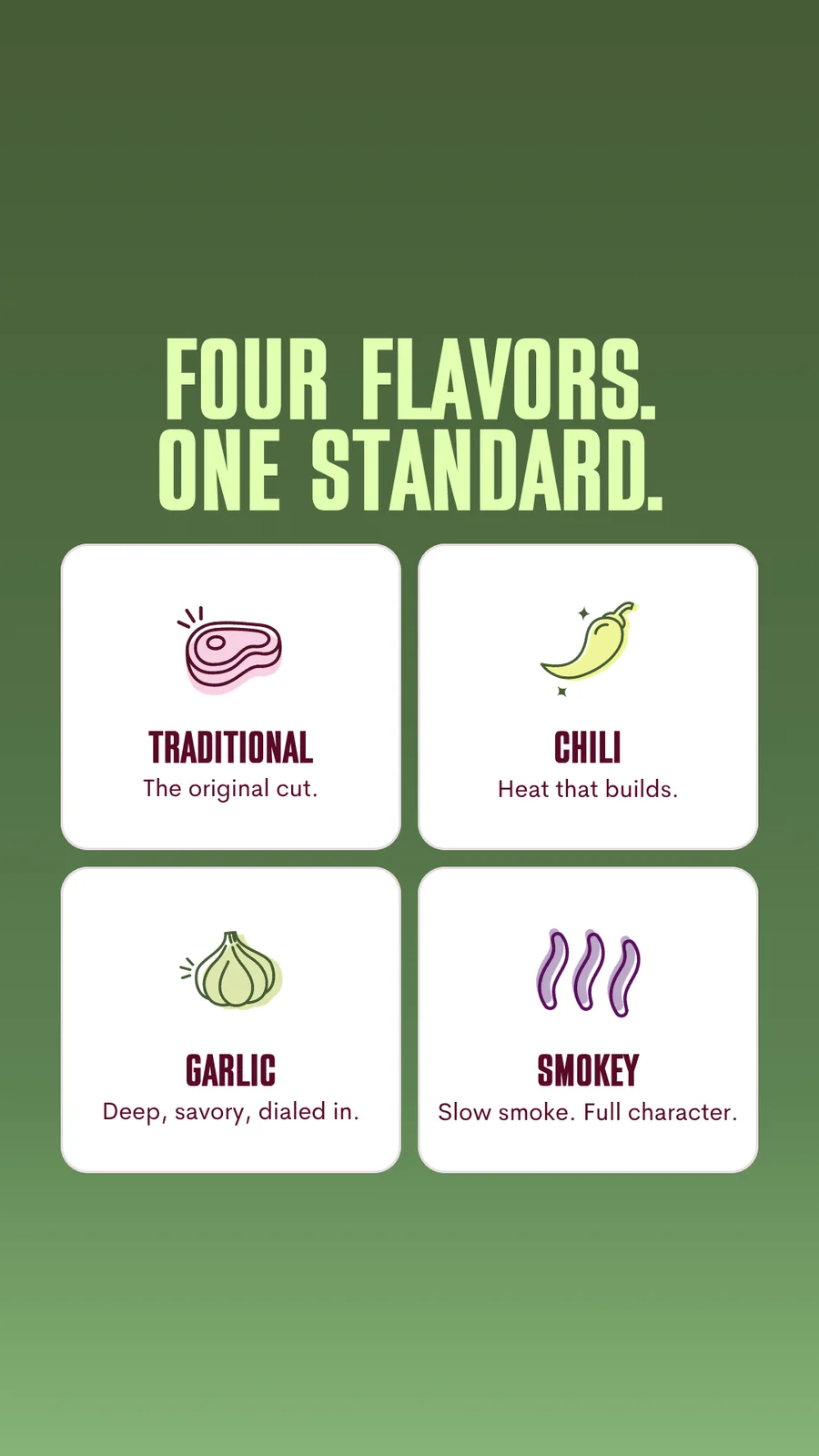
Story: four flavors, one standard, with a card for each of Traditional, Chili, Garlic and Smokey
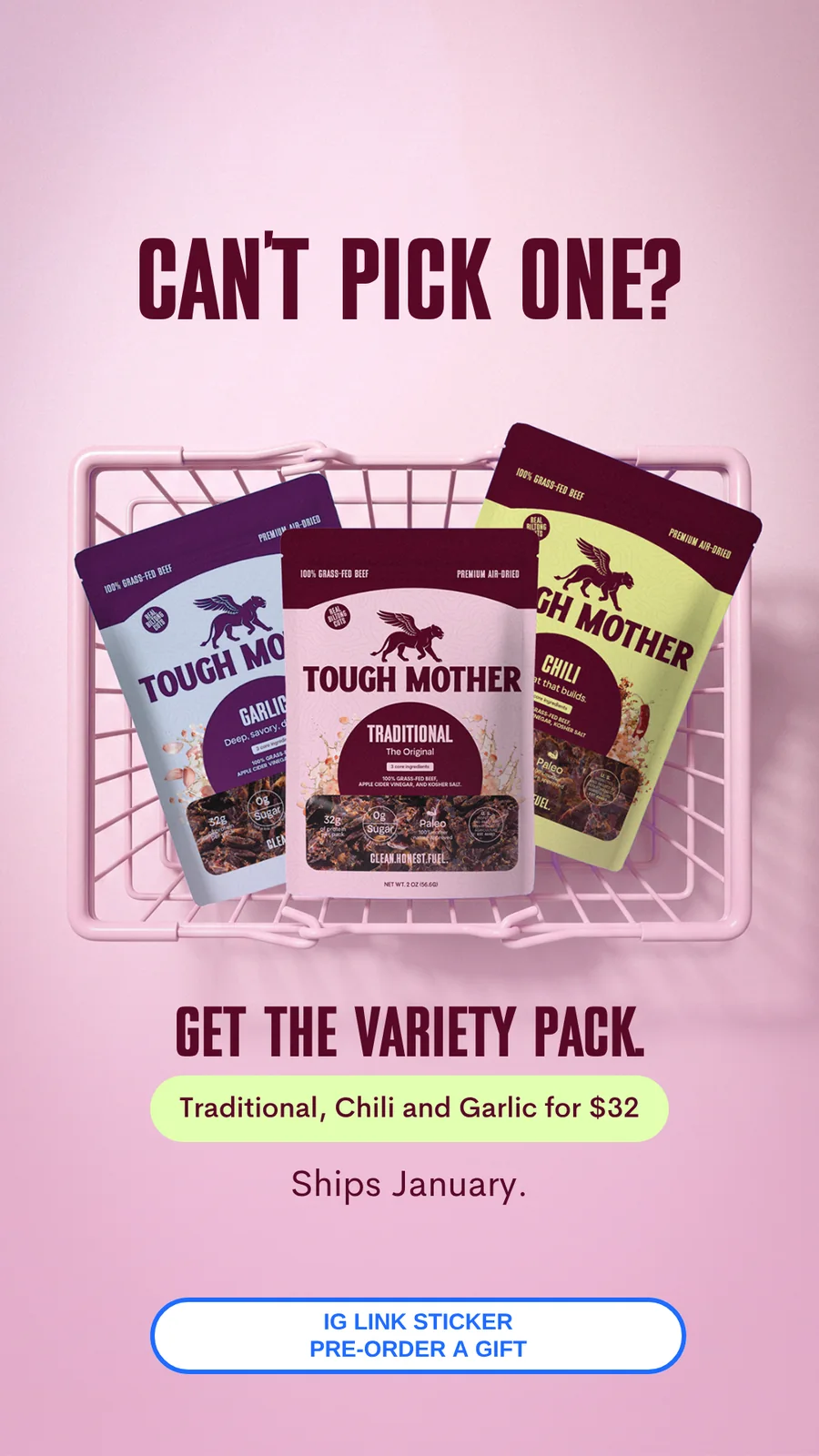
Story: can't pick one? Get the variety pack, over the three pouches in a pink basket
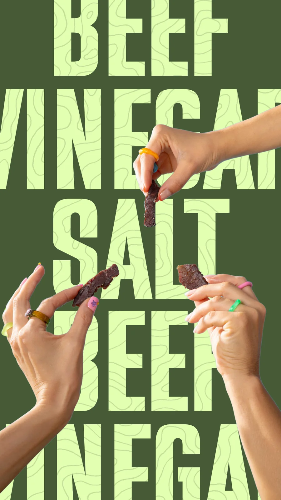
Story: beef, vinegar, salt set large in green, with hands reaching in holding biltong
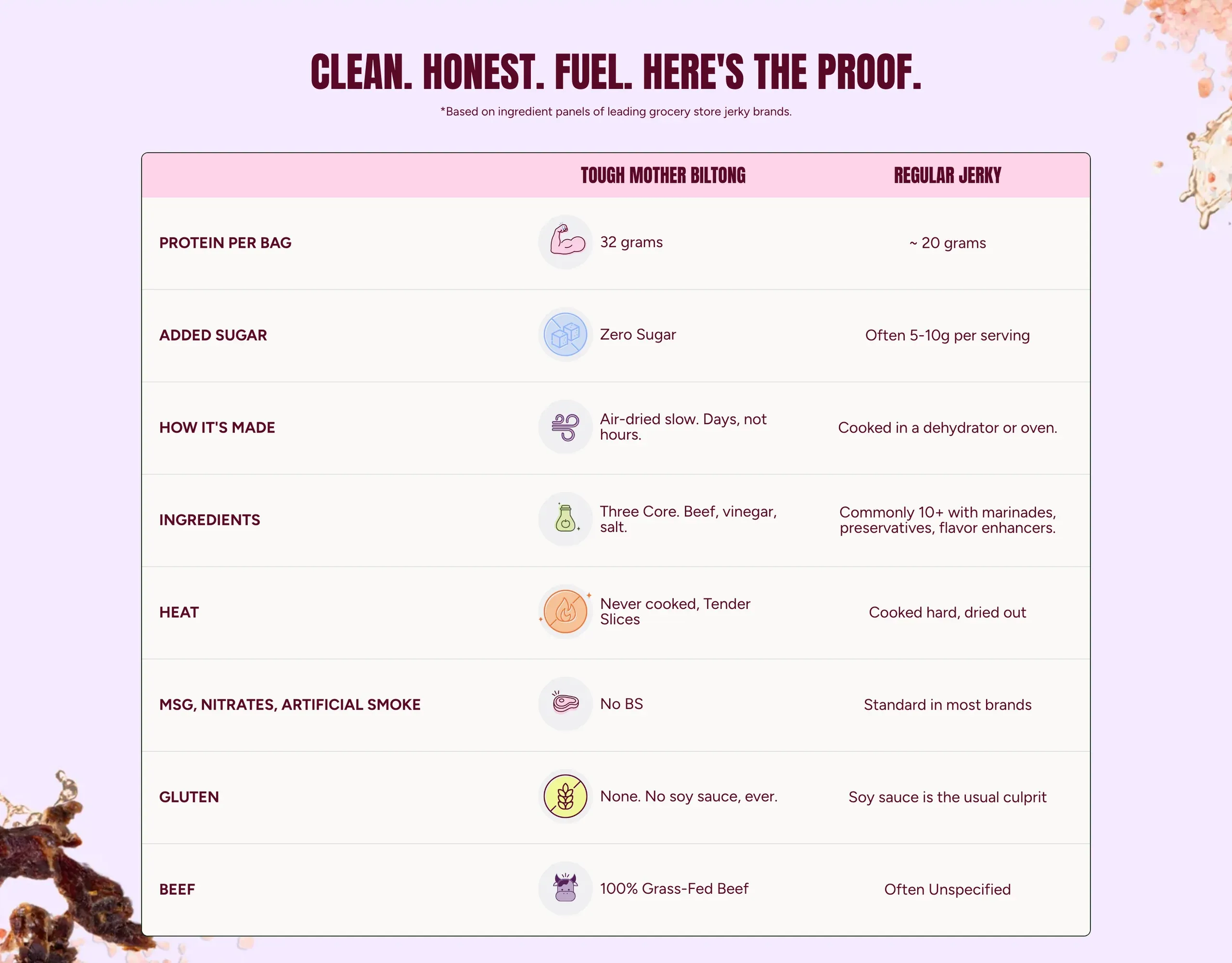
The comparison table from the site: Tough Mother biltong against regular jerky, line by line
07

Email

The one channel no
algorithm controls.

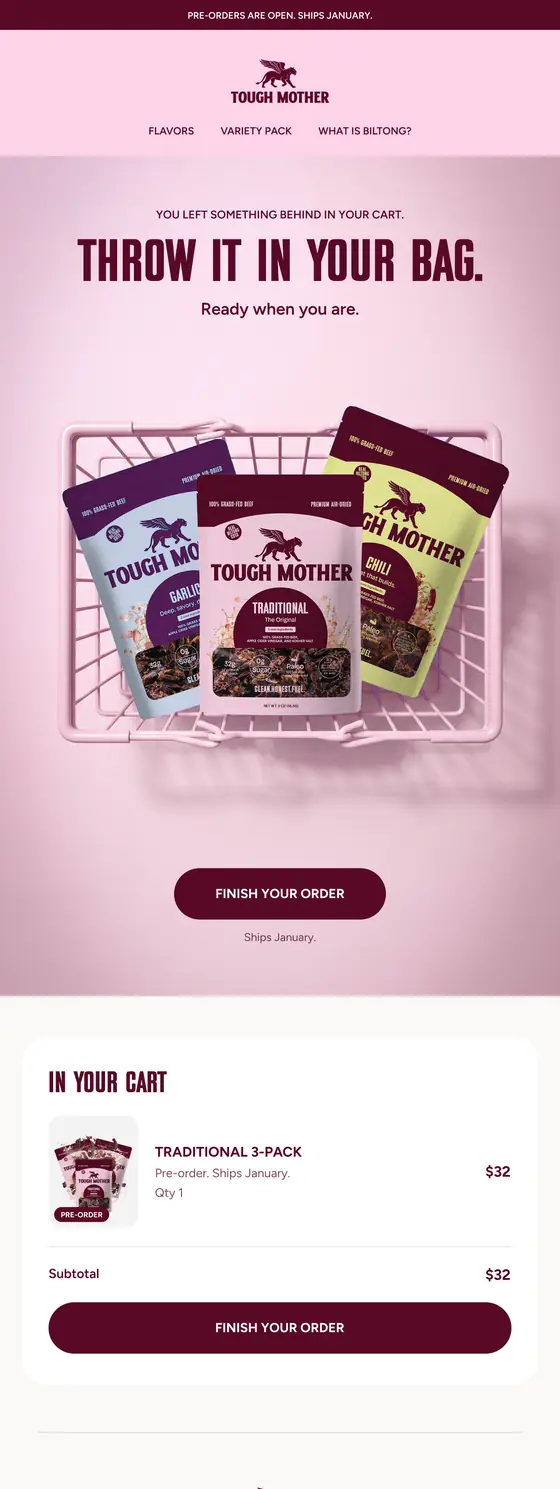
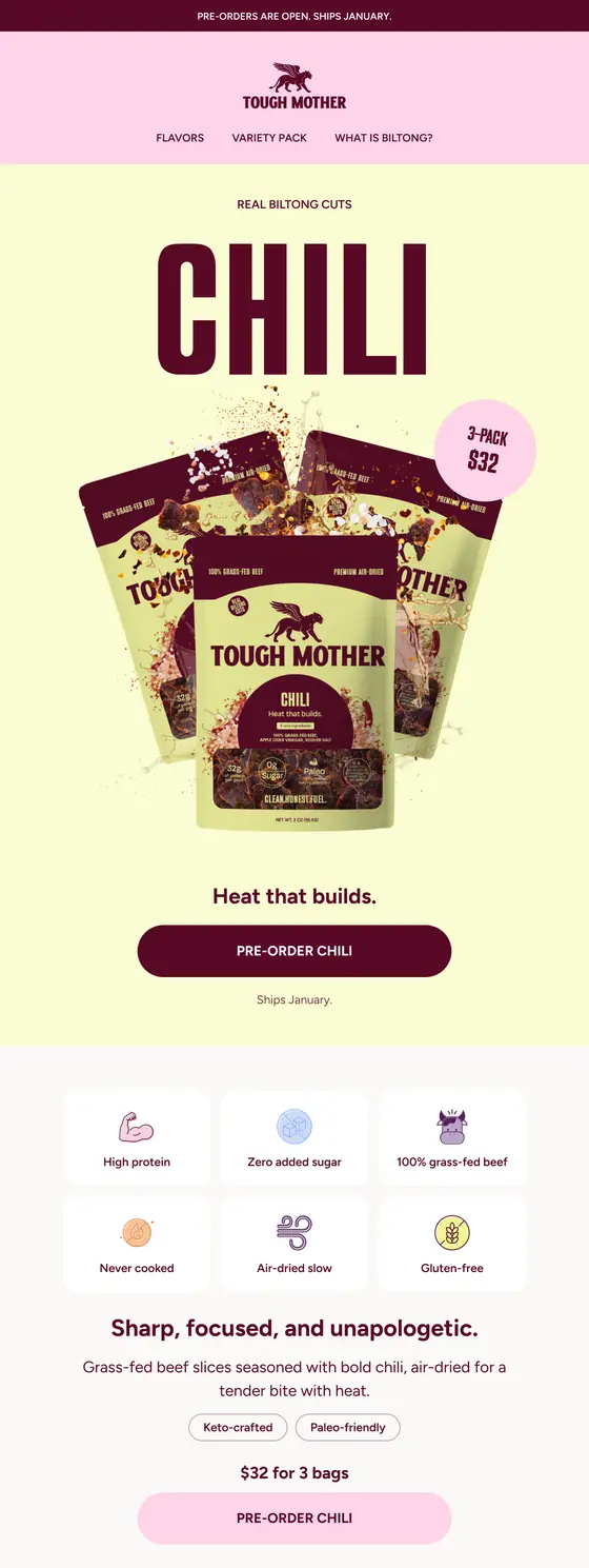
Fourteen emails, written and designed by us: the welcome, the pre-order announcement, one for each flavour, and the full post-purchase run, from what happens next to how to enjoy it.

The Tough Mother welcome email, scrolling: a photograph, a list of when to eat biltong, and the four flavours
Welcome to the Sisterhood
The pre-orders are open email, scrolling: the three core ingredients, the four flavours and the variety pack
Pre-orders Are Open
The Traditional flavour email, scrolling: the pack, what is in it, and how it is made
Flavour: Traditional

Start a project

Launching a CPG brand?

Tough Mother is mid-launch, so the results are still coming in. If you're taking a product to the shelf or to Shopify and want the brand, packaging, store and content to arrive together instead of one at a time, tell us what you're making.